Introduction
When picking in the top-10 of a draft, teams have one goal: select a franchise-altering player with star potential. Though some teams draft for need and prefer to select more NBA-ready players, in general, GMs do their best to select a player who may become a star.
This is very challenging. Many factors affect a player’s ability to become a star. Along with college performance, factors like athleticism, intangibles, injuries, coaching, and more change a player’s star potential.
As fans on the outside looking in, we have limited information on most of these factors except one: college performance. Though even the college performance of many players needs context (such as Cam Reddish’s low volume stats due to playing with Zion Williamson and R.J. Barrett), it’s one of the only quantifiable factors we can use. So, let’s try to use college stats to predict All-Stars in the top-10 of the 2019 draft.
Methods
First, I created a database of every top-10 pick from the 1990-2015 NBA drafts. We use 1990 as the limit because it ensures every player played their entire college career with a 3-point line. The 2015 draft was set as an upper limit so that all players played the entirety of their rookie contract, giving them some chance to make an All-Star team.
In addition to collecting their college stats, I marked whether the prospect made an All-Star team. There is no consideration for whether the player became an All-Star while on the team that drafted him, how long it took him to get there, etc. All data was collected from Sports-Reference.
Players who made an All-Star team at some point in their career earned a “1” in the All-Star column. Meanwhile, players who failed to make an All-Star team earned a “0.”
This represents a binary classification problem. There are two classes we’re looking at: All-Star and not All-Star. The models try to match each player to one of the two classes. We’ll also look at the prediction probability (probability for the player to be in the class) the models give each player.
To create the models, we used the following stats as inputs:
| Counting stats | Efficiency | Other |
|---|---|---|
| PPG | TS% | Pick |
| TRB | 3PAr | SOS |
| AST | FTr | |
| STL | ||
| BLK |
Note that win shares, box plus/minus, and other holistic advanced stats that are excluded. College BPM data is available only from the 2011 draft, and college WS data is available only from the 1996 draft. Therefore, using BPM restricts the data set massively. Though adding WS only excludes 6 years of drafts, the models were significantly less accurate when including WS.
The models predicted whether the player made an All-Star team (the 1s or 0s described above).
We collected the same set of stats for the top-10 picks in the 2019 draft. When using the models to All-Stars out of the 2019 draft, we’ll look primarily at the prediction probabilities of the positive class. A prediction probability of 0.75 indicates that the model is 75% certain the player will fall into class 1 (All-Star). Therefore, every player with a prediction probability above 0.5 would be predicted as a 1 if we just used the models to predict classes instead of probability.
Given that about 31% of top-10 picks since 1990, the prediction probabilities give us more information about the predictions. If we’d just predict the classes, we’d likely get 2-4 1s, and the rest be 0s. However, with the prediction probabilities, we can see whether a player has a higher All-Star probability than others drafted at his pick historically, making him a seemingly good value.
Note that unlike other problems like predicting All-NBA teams – where voters have general tendencies making the problem easy to predict accurately – predicting All-Stars is incredibly difficult. Players develop differently, and college stats alone are not nearly enough to accurately project a player’s All-Star potential. We don’t expect the models to incredibly accurate. After all, if they were, teams would use better models higher quality data to make predictions that would help them always pick All-Stars.
In total, we made four models:
- Logistic classifier (LOG)
- Support vector classifier (SVC)
- Random forest classifier (RF)
- Gradient boosting classifier (GBC)
Comparing All-Star and not All-Star stats
Let’s compare some college stats between All-Stars and not All-Stars. This will illustrate just how difficult it is to differentiate the two groups based off just their college stats.
Before diving into the differences (or lack thereof), let’s first establish how to read these plots. This type of graph is called a boxplot. The yellow line represents the median or middle value in each group. The top of the box signifies the 75th percentile, while the bottom of the box signifies the 25th percentile. So, the 25th-50th percentile can be seen between the bottom of the box and the yellow line. From the yellow line to the top of the box represents the 50th-75th percentile. The full box represents the 25th-75th percentile of the data.
The lines flowing out of the box are called “whiskers.” The top of the whisker, or the “T” shape, represents the greatest value, excluding outliers. The bottom whisker represents the opposite (the lowest value excluding outliers). From the top of the box to the top of the whisker represents the 75th-100th percentile. The bottom of the box to the bottom of the whisker represents the 0th-25th percentile. Therefore, the top of the box also represents the median of the upper half of the data set.
The dots above or below the whiskers represent outliers. Outliers above the whiskers represent points that are greater than the upper quartile (top of the box) + 1.5 times then interquartile range (top of the box – bottom of the box). Outliers below the whiskers represent points that are less than the lower quartile (bottom of the box) – 1.5 times then interquartile range (top of the box – bottom of the box).
First, let’s look at their points per game.
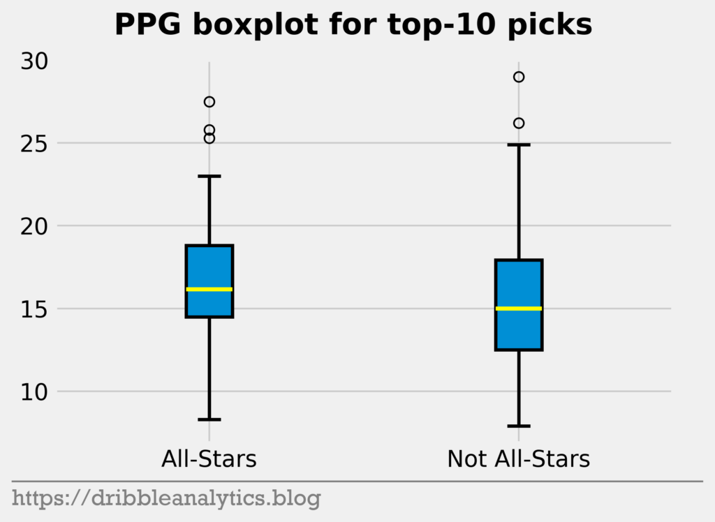
Though the All-Stars have a marginally higher median PPG, the not All-Stars have a higher upper quartile PPG (top of the whisker). Therefore, there’s no clear difference here between the two groups, especially given that the bottom whiskers extend similarly for both groups.
Next, let’s look at rebounds and assists. Because big men will get more rebounds, and guards will get more assists, All-Stars and not All-Stars seems to be an odd comparison. However, we’re just looking for differences in basic counting stats.
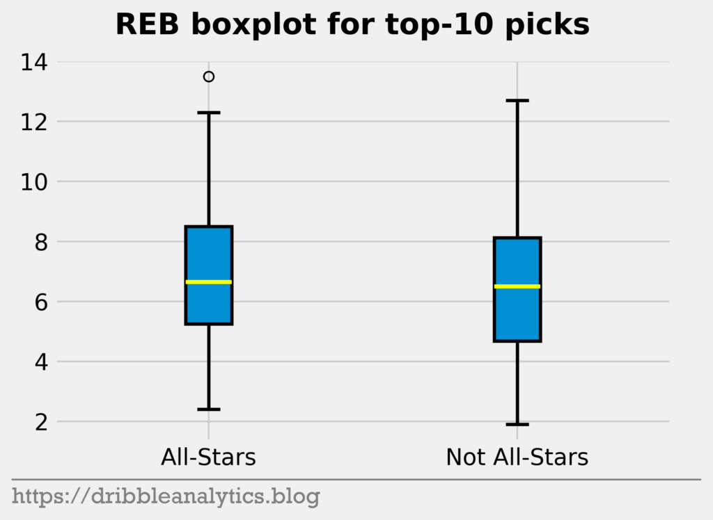
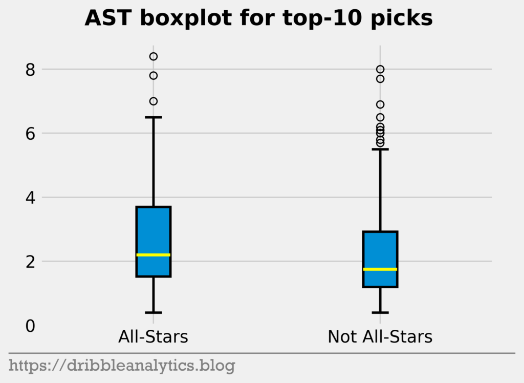
For rebounds, there’s practically no difference yet again. Both groups show a nearly identical median and very similar ranges. For assists, the All-Stars have a higher median assist total, and the 25th-75th percentile range stretches higher. Therefore, there’s a small difference between the two.
Let’s look at the difference in strength of schedule (SOS).
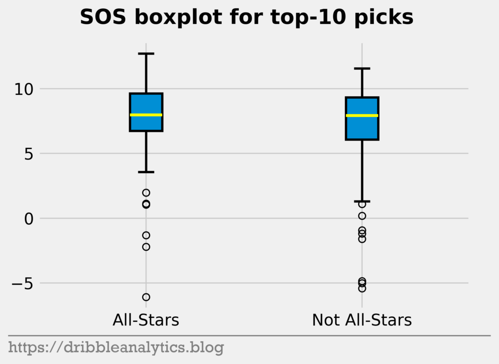
Yet again, there’s a minimal difference. The medians are almost equal. Though the All-Stars range is higher than the not All-Stars range, there are multiple low outliers for the All-Stars.
Lastly, let’s look at the difference in picks.
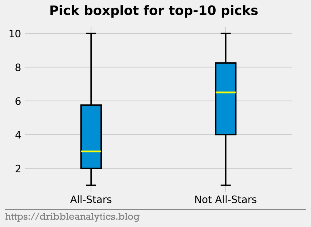
This is the first pronounced difference. The median pick of an All-Star is much lower than that of a not All-Star. Because no other stats showed any significant difference between the two groups, we can expect pick to be the most important feature in the models. Furthermore, this difference shows that NBA GMs are generally pretty good at drafting.
Model analysis
Model creation: data transformation
After creating the four models described above and testing their accuracy with basic metrics (discussed later), I did two things.
First, I tried manipulating the data. To make the models, I initially used the raw data. Sometimes, normalizing the data may lead to better performance. Normalizing the data means scaling each individual stat so that the highest value is 1 and the lowest value is 0. This can be done across the entire data set (the player with the highest college PPG would have a PPG input to the models of 1) or to each draft year (the player with the highest college PPG in each draft year would have a PPG input to the models of 1). Neither of these methods increased performance.
Next, I tried transforming the data into ranks. Instead of giving raw or normalized stats, we can simply rank all the players by their stats. Like normalization, this gives us some method to compare the players. However, ranking each stat for neither the entire data set nor each draft year improved performance.
After all, we’ll use the usual, raw data we got from Sports Reference.
Model creation: hyperparameter tuning
Every model has certain characteristics that determine how the model fits the data. These characteristics, or hyperparameters, make the model’s architecture. For example, if we were using an exponential model, the degree (quadratic, cubic, quartic, etc.) would be a hyperparameter. Hyperparameters impact the model’s performance.
In previous posts, I used nice round numbers for the model hyperparameters and played around with them randomly until I found a mix that yielded a strong model. However, this is not scientific.
For a scientific hyperparameter tuning, we can use a method called grid search. Grid search takes a grid of possible values for hyperparameters we want to test, creates a model for each possible combination, evaluates the model’s accuracy, and returns the “best” model. In this case, we want to find the model that has the best recall (a metric we’ll discuss soon).
The SVC, RF, and GBC saw their performance improve with the hyperparameters from the grid search. So, for those models, we used the best parameters found by the grid search. For the LOG, we used the parameters we set before the grid search (in this case, the default).
Basic goodness-of-fit
We measure the performance of classification models in several ways. The simplest metric is accuracy, which measures the percentage of predictions the model made correctly. Essentially, it takes the list of predictions and finds how many values in the list were perfect matches to the list of results.
Because this is the simplest classification metric, it has its flaws. Accuracy only measures correct predictions, so it may be misleading in some cases. For example, if we’re predicting something very rare, then almost all the results will be 0s. Therefore, a model that exclusively predicts 0s will have a high accuracy even if it has no predictive power.
Given that there are more not All-Stars than All-Stars, accuracy is not the best metric in this case. 30% of the testing set consists of All-Stars, meaning a model could achieve 70% accuracy by predicting all 0s (that no one will be an All-Star). However, because picking correct All-Stars at the expense of picking some incorrect All-Stars is better than picking no All-Stars at all, it’s fine to have an accuracy less than 70%.
To understand the next few classification metrics, we must first establish some terms. A true positive occurs when the model predicts a 1, and the actual value is a 1 (meaning the model correctly predicted an All-Star). A true negative is the opposite; the model correctly predicts a 0. False positives occur when the model predicts a 1 where the actual value is 0, and false negatives occur when the model predicts a 0 where the actual value is 1.
Recall measures a model’s ability to predict the positive class. In this case, it’s the model’s ability to find all the All-Stars (true positives). Recall = TP / (TP + FN), meaning that a “perfect” model that predicts every positive class correctly will have a recall of 1. Recall is arguably the most important metric here.
Precision measures how many of the returned predicted All-Stars were true. It penalizes the model for incorrectly predicting a bunch of All-Stars. Precision = TP / (TP + FP), meaning that a “perfect” model will have a precision of 1. Notice that there is typically a trade-off between precision and recall given that recall measures ability to find true positives, while precision measures ability to limit false positives.
To combine the two metrics, we can use F1. F1 = 2(precision * recall) / (precision + recall). By combining precision and recall, F1 lets us compare two models with different precisions and recalls. Like recall and precision, F1 values are between 0 and 1, with 1 being the best.
Now that we’re familiar with some classification metrics, let’s examine the models’ performance. The table below shows the scores of all four models on the previously mentioned metrics.
| Model | Accuracy | Recall | Precision | F1 |
|---|---|---|---|---|
| LOG | 0.746 | 0.316 | 0.667 | 0.429 |
| SVC | 0.762 | 0.263 | 0.833 | 0.4 |
| RF | 0.746 | 0.368 | 0.636 | 0.467 |
| GBC | 0.73 | 0.368 | 0.583 | 0.452 |
The RF and GBC had the highest recall, though the RF had higher precision and accuracy than the GBC. Although the SVC had the highest precision and accuracy, we’re most concerned with recall, meaning the other models are stronger. The LOG appears slightly weaker than the RF and GBC, though it’s still a strong model.
As mentioned before, we’re not expecting dazzling performance from the models. After all, if models using publicly available data could predict All-Stars, NBA teams with full analytics staffs would have no problem finding them. Therefore, though these metrics are not encouraging by themselves, they show that the models have some predictive power.
Improvement over random
To show that the models are stronger than randomly predicting All-Stars, I made a dummy classifier. The dummy classifier randomly predicts players to be a 1 or 0 with respect to the training set’s class distribution. Given that the training set had 32% All-Stars (the testing set had 30% as mentioned earlier), the dummy classifier will randomly predict 32% of the testing set to be All-Stars.
The table below shows the dummy classifier’s performance.
| Model | Accuracy | Recall | Precision | F1 |
|---|---|---|---|---|
| Dummy | 0.556 | 0.316 | 0.286 | 0.3 |
Each of our four models has higher accuracy, precision, and F1 scores than the dummy classifier. It is slightly concerning that the dummy classifier has equal recall to the LOG and higher recall than the SVC. Nevertheless, the LOG and SVC were much better at getting their All-Star predictions correct when they did predict them (higher precision).
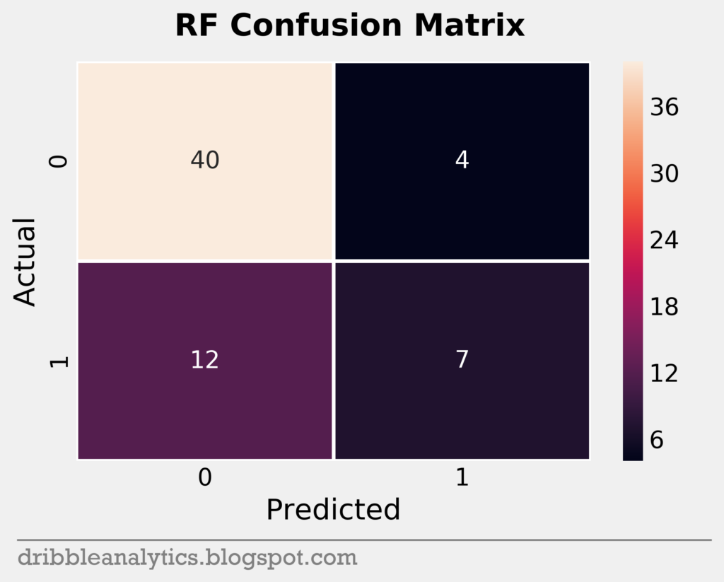
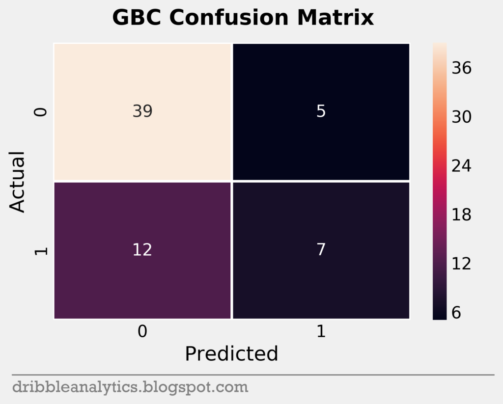
Confusion matrices
To help visualize a model’s accuracy, we can use a confusion matrix. A confusion matrix shows the predicted vs. actual classes in the test set for each model. It plots each model’s true positives (bottom right), true negatives (top left), false positive (top right), and false negatives (bottom left) in a square.
The testing set was small; it had only 63 data points. Below are the confusion matrices for all four models.


Cross-validation
As we do in other machine learning posts, we want to cross-validate our models. This will ensure that they didn’t “memorize” the correct weights for this specific split of data, meaning they overfit.
In classification problems, it’s important to see that the class balance is close to even between the training and testing set. This could influence cross-validation, given that a different split of the data might have a large imbalance. Our training set had 32% All-Stars while our testing set had 30% All-Stars, making this a non-factor.
The table below shows the cross-validated accuracy (k = 3) and the scores’ 95% confidence interval.
| Model | CV accuracy | 95% confidence interval |
|---|---|---|
| LOG | 0.665 | +/- 0.096 |
| SVC | 0.683 | +/- 0.027 |
| RF | 0.746 | +/- 0.136 |
| GBC | 0.633 | +/- 0.135 |
Every model has a cross-validated accuracy score that’s close to its real accuracy score.
Log loss and ROC curves
The final metrics we’ll use are log loss and ROC curves.
Log loss is essentially like accuracy with prediction probabilities instead of predicted classes. Lower log loss is better. Because we’re interested in the prediction probabilities, log loss is an important metric here. Though log loss isn’t exactly simple to interpret by itself, it’s useful for comparing models.
The table below shows the four models’ log loss values.
| Model | Log loss |
|---|---|
| LOG | 0.546 |
| SVC | 0.56 |
| RF | 0.556 |
| GBC | 1.028 |
The biggest takeaway from the log loss is that the GBC may not be as strong as we initially thought, given that all the other models have significantly lower log loss scores.
The second to last metric we’ll look at is the receiver operating characteristics (ROC) curve and the area under it. The curve shows the “separation” between true positives and true negatives by plotting them against each other. The area gives us a numerical value for this separation.
A model with no overlap in probability between TP and TN (perfect) would have a right-angled ROC curve and an area under the curve of 1. As the overlap increases (meaning the model is worse) the curve gets closer to the line y = x.
The ROC curves and the area under the curve for each model is below.
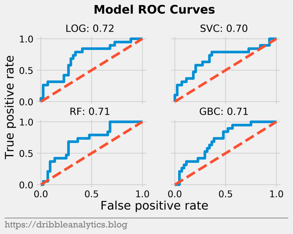
Each model has a similar ROC curve and area under the curve.
Why do the models predict what they do?
Before going into the results, the last thing we’ll want to look at is what the models find important in predicting All-Stars. There are a couple ways to do this.
First, we’ll look at the model coefficients and feature importances. The LOG and SVC have coefficients, while the RF and GBC have feature importances. Coefficients are different from feature importances in that the coefficients are used to express the model in an equation. Higher coefficients do not mean the feature is more important, they just mean the model scaled that feature differently. On their own, they don’t have much meaning for us, but for comparison purposes, we can see which model scales a certain factor more.
The graph below shows the coefficients of the LOG and SVC.
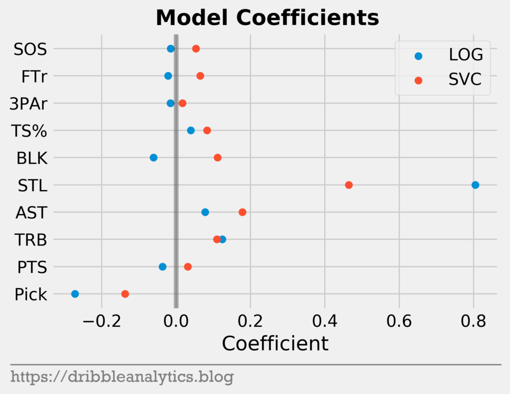
The two models have very similar coefficients for the most part. The two main differences are in the steals and blocks coefficients. While the LOG gives blocks a negative coefficient, the SVC gives it a positive coefficient. Furthermore, the LOG gives steals a much higher coefficient than the SVC.
Next, let’s look at feature importances. Feature importance shows how much the model relies on a feature by measuring how much the model’s error increases without it. Higher feature importance indicates more reliance on the feature.
The graph below shows the feature importances of the RF and GBC.
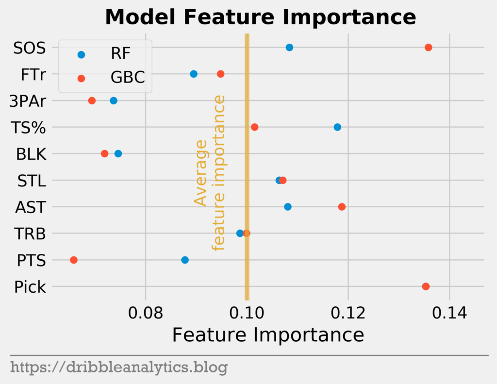
As we would expect, pick was the most important feature for both models (the GBC point covers the RF point). Interestingly, SOS was almost as important to the GBC as pick.
Shapley values
To get a more detailed view of how each feature impacted each model, we can use a more advanced model explanation metric called Shapley values.
Shapley value is defined as the “average marginal contribution of a feature value over all possible coalitions.” It tests every prediction for an instance using every combo of our inputs. This along with other similar methods gives us more information about how much each individual feature affects each model in each case.
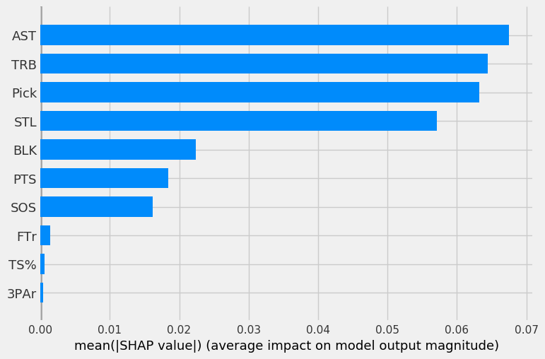
First, we’ll look at the mean SHAP value, or average impact of each feature on each of the four models. A higher value indicates a more important feature.
The four graphs below show the mean SHAP values for each of the four models (in order of LOG, SVC, RF, GBC).
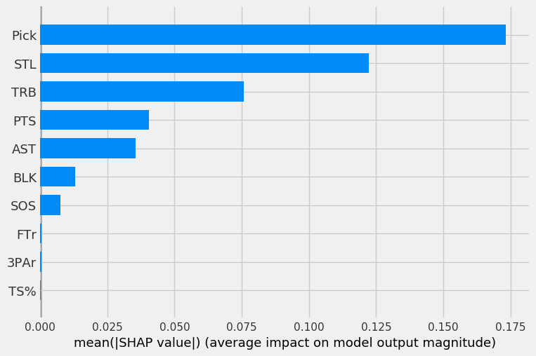
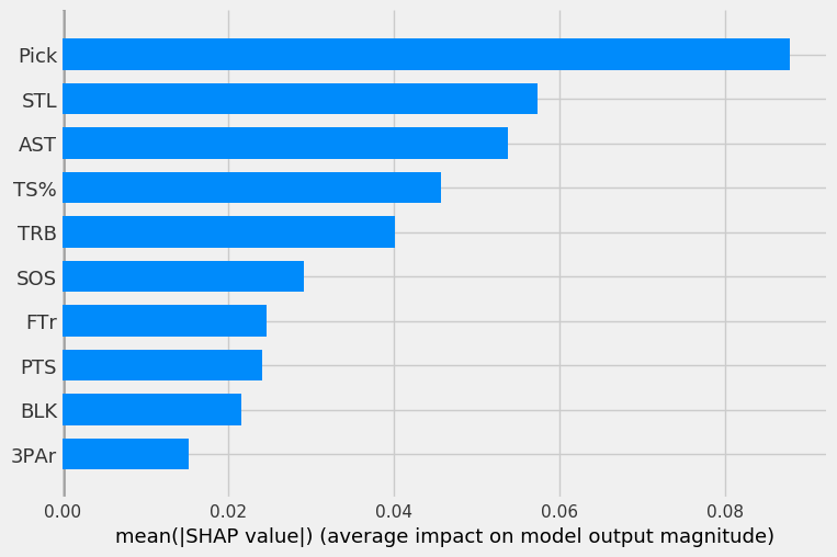
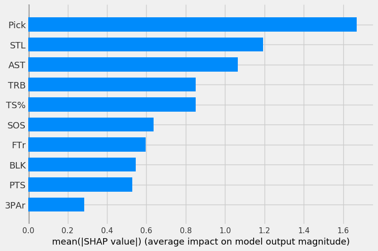
The LOG, RF, and GBC all have pick as the most important feature, as expected. Steals being the second most important feature is surprising. The three models all have pick, steals, rebounds, and assists in their top-5 most important features.
The SVC has odd results, as pick was only the third most important feature behind rebounds and assists.
To get a more detailed and individualized view of the feature impacts, we can look at the SHAP value for each point.
In the graphs below, the x-axis represents the SHAP value. The higher the magnitude on the x-axis (very positive or very negative), the more the feature impacts the model. The color indicates the feature value, with red being high values and blue being low values. So, a blue point for pick indicates the player was picked early.
With these plots, we can make conclusions like “pick is very important to the models when its value is low but becomes less important as players are picked later.”
The four graphs below show the individual point SHAP and feature values.
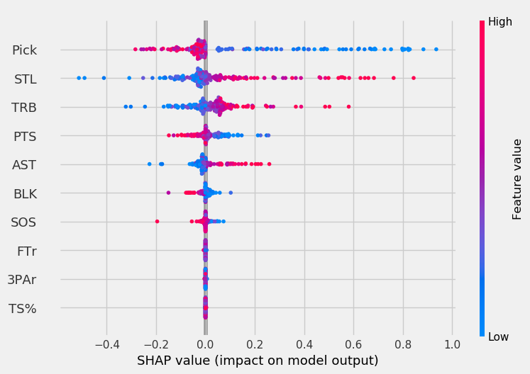
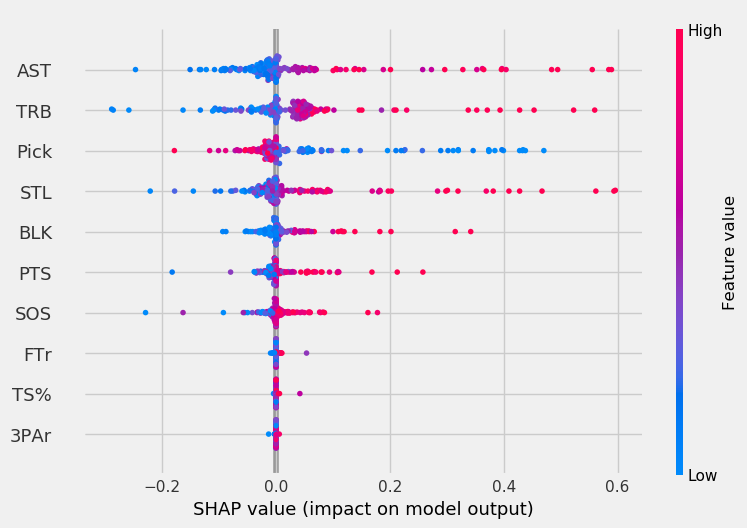
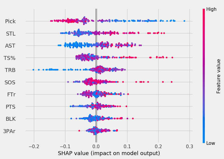
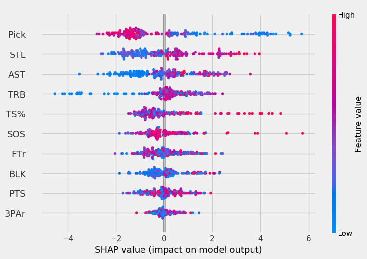
For the LOG, pick mattered a lot when its value was low. As players were picked later, it had less of an impact on model output. The SVC was more affected by high assists, rebounds, and steal values than low pick values, unlike other models.
Rebounds had minimal impact on the RF except for cases where the player’s rebound total was very low. The opposite is true for TS% in both the RF and GBC; generally, TS% had minimal impact on the model except for the highest TS% values. For the GBC, the highest SOS values had a very high impact on model output.
Results
To make predictions for the 2019 draft, we looked at prediction probabilities instead of predicted classes. This gives us each model’s probability that the player makes an All-Star team.
The four graphs below show each model’s predictions.
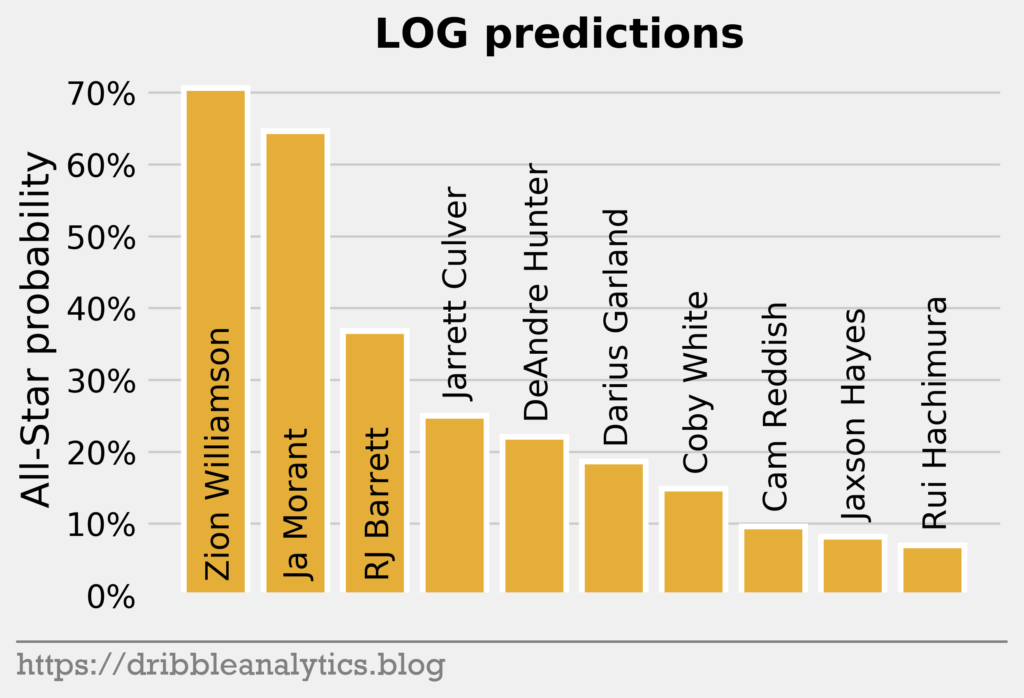
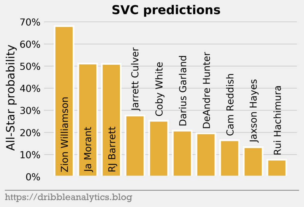
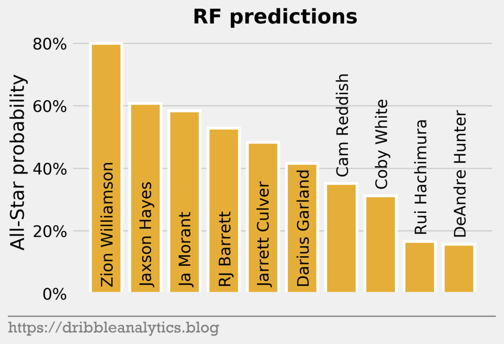
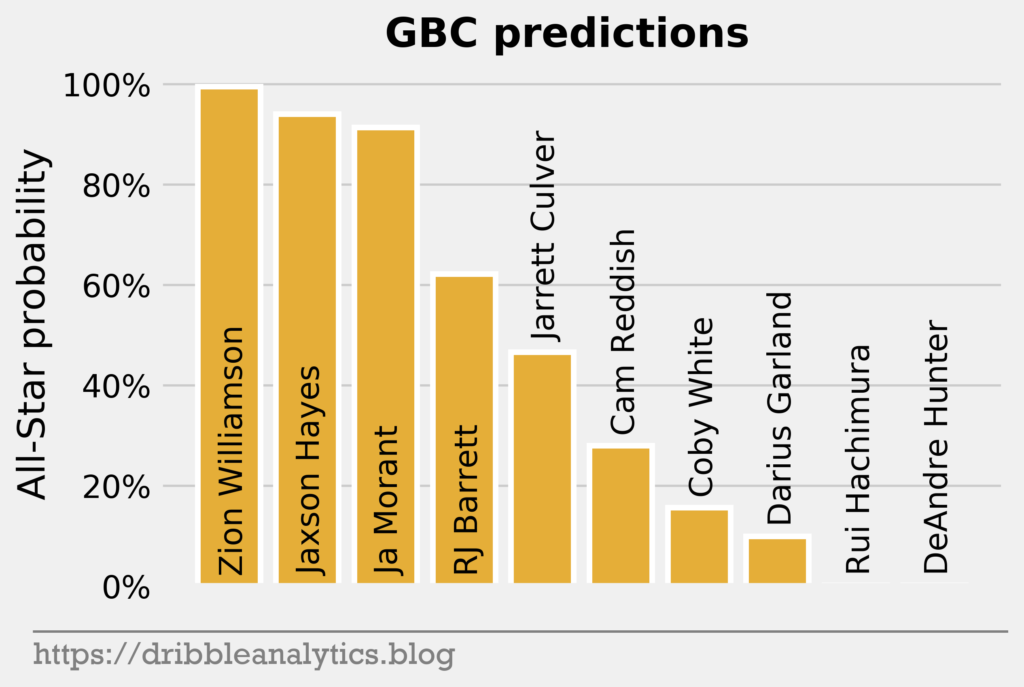
Every model gives Zion the highest All-Star probability. The LOG and SVC’s top-3 in All-Star probability mimic the draft’s top-3. However, the RF and GBC love Jaxson Hayes; both models gave him the second-highest All-Star probability, just above Ja Morant. Both the RF and GBC also dislike DeAndre Hunter, giving him the lowest All-Star probability.
The graph below shows the average prediction of the four models.
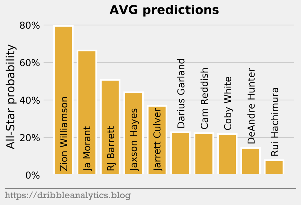
The RF and GBC propel Jaxson Hayes to the fourth-highest average predicted All-Star probability.
The table below shows each model’s predictions and the average of the predictions.
| Pick | Player | LOG | SVC | RF | GBC | Average |
|---|---|---|---|---|---|---|
| 1 | Zion Williamson | 0.71 | 0.63 | 0.80 | 1.00 | 0.78 |
| 2 | Ja Morant | 0.65 | 0.49 | 0.58 | 0.91 | 0.66 |
| 3 | RJ Barrett | 0.37 | 0.49 | 0.53 | 0.62 | 0.50 |
| 4 | DeAndre Hunter | 0.22 | 0.23 | 0.16 | 0.00 | 0.15 |
| 5 | Darius Garland | 0.19 | 0.24 | 0.42 | 0.10 | 0.23 |
| 6 | Jarrett Culver | 0.25 | 0.30 | 0.48 | 0.47 | 0.37 |
| 7 | Coby White | 0.15 | 0.27 | 0.31 | 0.16 | 0.22 |
| 8 | Jaxson Hayes | 0.08 | 0.17 | 0.61 | 0.94 | 0.45 |
| 9 | Rui Hachimura | 0.07 | 0.11 | 0.17 | 0.00 | 0.09 |
| 10 | Cam Reddish | 0.10 | 0.20 | 0.35 | 0.28 | 0.23 |
To determine the best value picks according to the models, we can compare each player’s predicted All-Star probability to the percent of players drafted in his slot that made an All-Star team in our data set (1990-2015 drafts). So, if a first pick and a tenth pick both have 80% All-Star probability, the tenth pick will be a better relative value because many more first picks make All-Star teams.
The graph below shows the All-Star probability minus the percent of players drafted in the slot that make an All-Star team for each player.
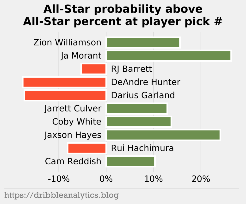
The graph below sorts the difference from greatest to least.
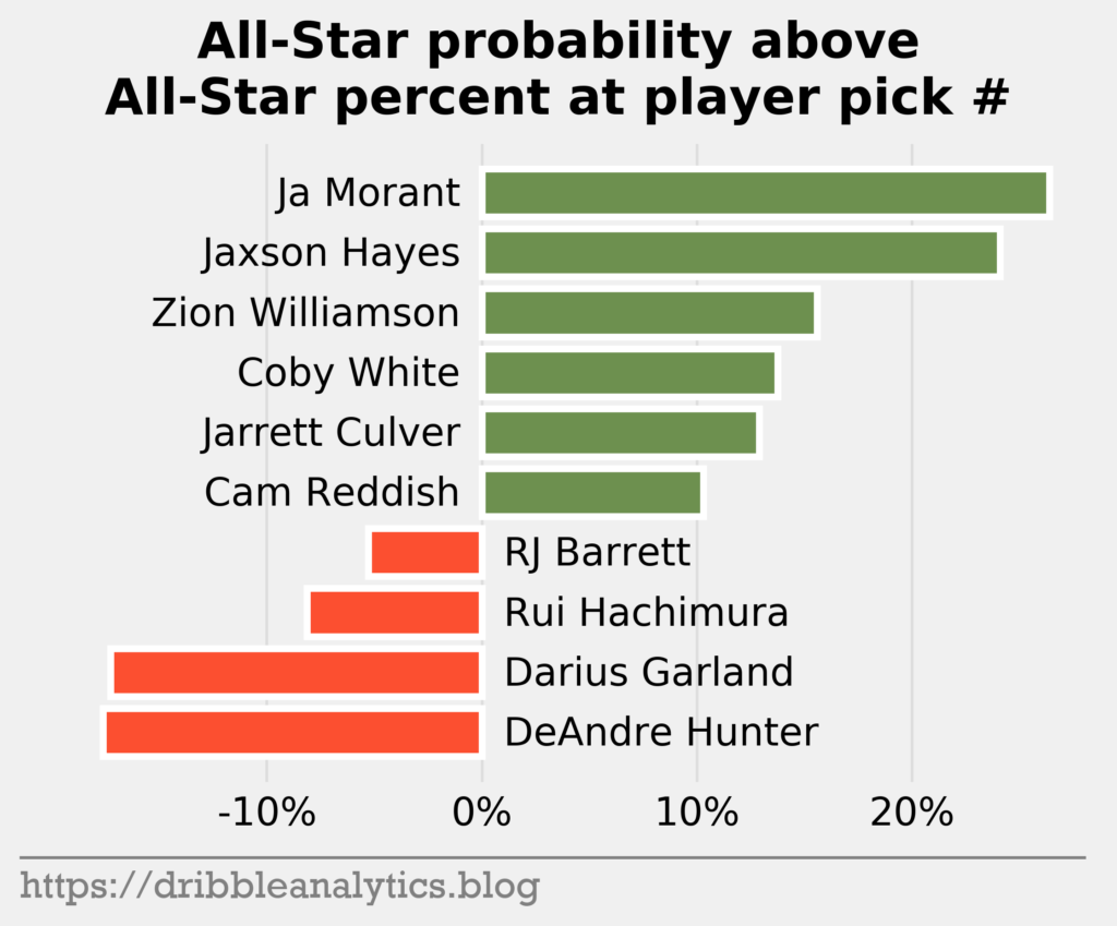
The models love Ja Morant and Jaxson Hayes as great values. Meanwhile, the models dislike the #4 and #5 picks – DeAndre Hunter and Darius Garland.
Part of the reason Morant has such a large difference is that #2 picks have an unusually low All-Star total. The table below shows the difference in All-Star probability. Notice that only 40% of #2 picks in our data set made an All-Star team, while 56% of #3 picks made one.
| Pick | Player | All-Star % at pick # since 1990 | Average prediction | Difference |
|---|---|---|---|---|
| 1 | Zion Williamson | 0.64 | 0.78 | 0.14 |
| 2 | Ja Morant | 0.4 | 0.66 | 0.26 |
| 3 | RJ Barrett | 0.56 | 0.50 | -0.06 |
| 4 | DeAndre Hunter | 0.32 | 0.15 | -0.17 |
| 5 | Darius Garland | 0.4 | 0.23 | -0.17 |
| 6 | Jarrett Culver | 0.24 | 0.37 | 0.13 |
| 7 | Coby White | 0.08 | 0.22 | 0.14 |
| 8 | Jaxson Hayes | 0.2 | 0.45 | 0.25 |
| 9 | Rui Hachimura | 0.16 | 0.09 | -0.07 |
| 10 | Cam Reddish | 0.12 | 0.23 | 0.11 |
Conclusion
Because predicting All-Stars is difficult and depends on more than just college stats, our models are not objectively accurate. Nevertheless, they can provide insight into the All-Star probabilities of the top-10 picks of this year’s draft.
Each of the four models predicts Zion is the most likely player to make an All-Star team. Two of the models give the second spot to Morant, while two of the models give the spot to Jaxson Hayes. Relative to historical All-Stars drafted at each slot, Morant and Hayes appear to be great values, while Hunter and Garland appear poor values.